And one of the scariest realities is, people actually want to know about you.
Not only that, they want to know what you look like. Can you believe I've already had photo requests? Not for Stuart's dartboard either. I think it's that Konrath character impersonating a normal person. And see what happened to his picture? Can't wait to see what he'll do with mine...
I've redesigned my website. So far, only one page is uploaded - the rest is coming. Kevin's just so busy with his course, it isn't even funny. So hopefully, this time next week when I'm packing for my flight you guys can sniff and eat popcorn while reading my website.
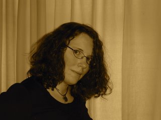
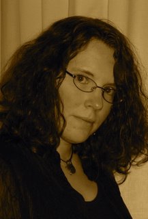
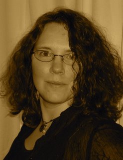
Now, I have to pick some publicty photos...and I have a few differences of opinion already expressed.
Bear in mind I hate them all like I hate all pictures of me, and will be posing for the camera as soon as possible in the hopes that something better will emerge.
Or pay to hire a stand-in to fake being me.
So, cast your vote:
Photo A: I might need to vomit

Photo B: Not amused

Photo C: Curses the fact that she was born with curly hair, dammit!

None of these are the ones that are actually on my home page home page. I guess you can vote for the slightly freaked look as well.
Ugh.
And on that note, I'm going to bed. I will have a more normal post up in the am my time - I'm just so damned fried at night these days that it's all I can do to find my pillow.
G'night.


17 comments:
I like the second one best. I think it looks most "author-like." :) Have you thought about pulling back your hair, either just on the sides or into a bun?
Listen to me, giving photo advice. I hate my photos too. The one in my profile is nearly two years out of date, but it is literally the only one I can stand out of about 20 years' worth of photos. Heaven help me if I get published... I WILL be hiring a professional makeover artist!
Photo B! But crop it tight so that it is just your face with part of the hair...I'm not as excited about the curtains in the back. I think the photo could be really strong cropped!
C C C C C!!!
PHOTO C!!
Listen to me. PHOTO C!!
You're so pretty in Photo C.
So gooooo C C C C C.
I'm going to go against the grain here and vote for C. Makes you look more approachable.
I like C also! I like that little smile...very cool.
The picture on your website looks like it is stretched horizontally!
"C"
I like the direct look -eyes penetrating their brains look - the hint of humor.
In the first two the shy look might be taken as devious.
I don't think you'll go far wrong with either 'B' and 'C'. 'B' is a bit more enigmatic, 'C' a bit more open (though it could just be me, but 'C' gives me a stronger impression of someone who isn't entirely comfortable having their picture taken).
Steady on now, Boy Kim, she'll set Evil Kev on you.
I reckon you can't go far wrong with C, Sandra, but I also think B, cropped a but tighter, has a lot going for it, if only you'd managed the same enigmatic smile you had in A.
And if that's not good, simple advice, I don't know what is.
Christa, oh, it really depends. But I looked into the price tag for the pro thing - a whopping $250 and a six-hour window for the photo shoot.
Which is a wee bit more than I want to spend right now.
Sucks that I'm the photographer in the family. And it was snowing Monday, so we had to make due inside and the other backdrop didn't work.
What if I use B on my website and C for my interview photos?
Bernita, isn't devious a good thing for a mystery author?
Kim, I wanted the maroon backdrop on the website - it didn't look right, somehow. I'm still thinking of a way to make it work.
James, evilkev isn't that heavy. If he was I couldn't lift him.
And he's remarkably relaxed. After all. I'm coming over the UK alone!
Whatever you're doing with your tutu, I don't want to know!
Not A. You're close with B & C, but not quite. You are a very smart woman with a great sense of humor who projects very real human characteristics in her writing. Find one that shows those. Your physical beauty will still be there too.
You should be pleased that two out of three photos looks good. A friend of mine took about thirty pictures for my short film's press pack and only three of those were any good (well, the pictures were good, it was just the subject that wasn't up to scratch).
I think photo C proves you will get a knock-out picture from a pro.
You will get years of mileage from great picture, so my vote is to drop the money for the photo shoot. Lighting, background, and atmosphere will make the picture leap off the page. In our visual culture, I think it's money well spent.
Well, if the pro ever gets back to me about a shooting schedule, I'll consider it.
Though really, ouch.
I mean, all I need right now is a small headshot. Konrath's been begging for one for his dartboard.
Ooo. Photo B has an alluring, mysterious quality to it. I like it. But I can see how Photo C would work, too. But for a book cover, I'd use B.
C - definitely C.
You look almost normal in that one.
You're so dead, MacBride! Next book I write...
Post a Comment